Refreshing the website for an incorporate who didn't update their online presence since 2015
OVERVIEW
Company Background
Calgary Silkscreen Inc. has been the one-stop shop for many local businesses and organizations since 1983. They provide custom printing, promotional solution and embroidery services to a wide range of clients from individuals that are in demand, many scale apparel clothing lines, marketing firms, local businesses, government organizations etc.
Role Product designer Timeline 2020
Skills
• Graphic Design
• UI/UX Design
• Information Architecture
• Prototyping
• Design System
• Product Thinking
DISCOVERY
Website was updated in 2015!
The website design was outdated compared to existing trends and designs.
Lack of structure in the sitemap, some unnecessary repetitive content with a different page that doesn't correlate to the title.
The company is famous for an unmatched leader in the industry by providing superior quality and on-point customer services. While aiming to preserve the existing value, they are aware that it was time for them to refresh and polish their online presence to approach a larger scope of clients.
Also, they didn’t have the proper analytic system to keep track of the traffic and performance, which resulted in the false performance evaluation. With no data to based on, the company could develop a strategy that does not impact their current and future customer.
Refreshing the look while preserving the traditional business values
Redesign the Website
Restructuring the website is essential to guide potential customers through a designated flow that can boost key performance goals, specifically increasing quote submissions.
Project Goals:
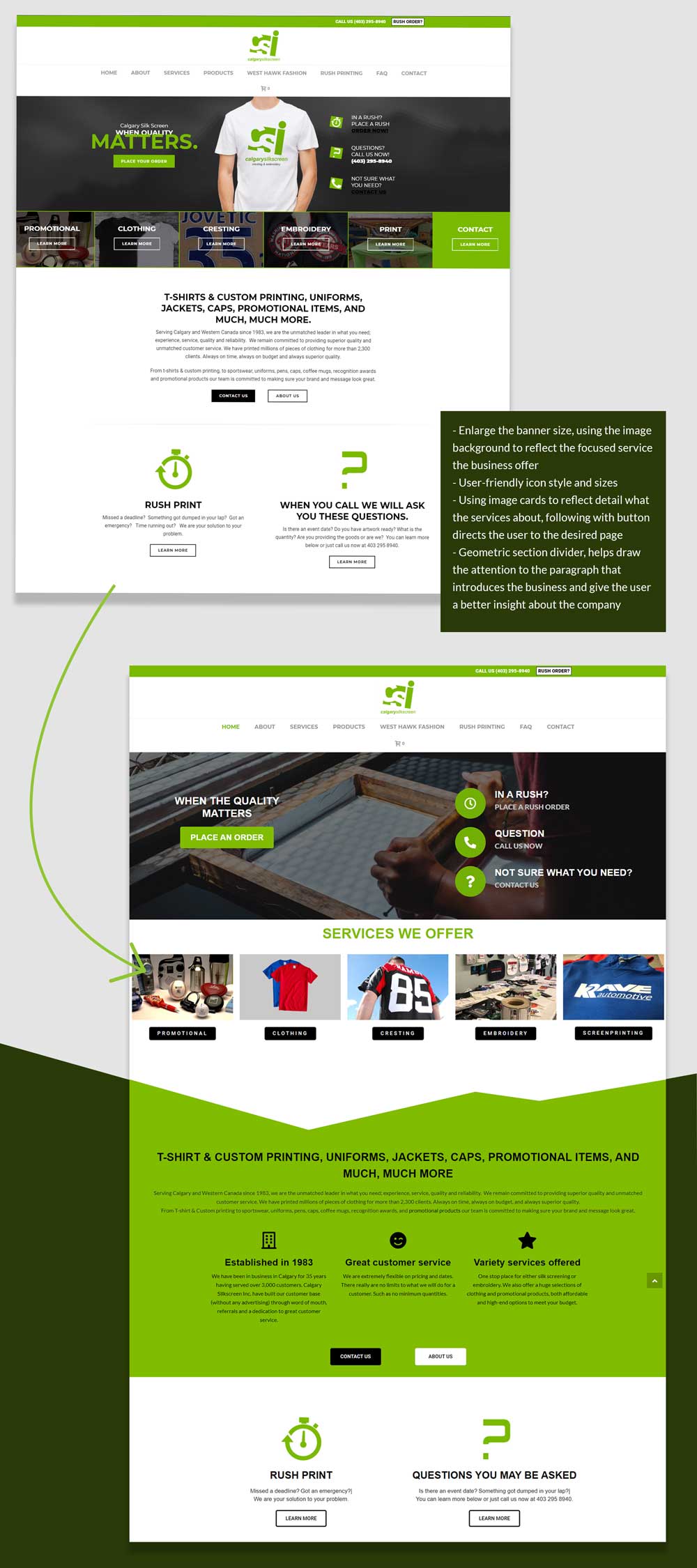
Revamp the visual appearance with a bolder design, stronger brand identity, and engaging animations to draw attention to important content.
Highlight services and showcase client feedback to build credibility, emphasizing the broad scope of clients served.
Better organize the website to target the right potential customers effectively.
DESIGN PROCESS
I. Information Architectural
Long duration sessions duration is not always positive
• Remove the unnecessary sections and focus on building the impression of the company's expertise in the services that they offer.
• The complicated navigation will increase the drop rate since customers get distracted and have to browse over too many pages to get all the information they need.
• Add navigation of product page and e-commerce increase traffic and sale, where the customer could browse to see of products the company offers
II. Prototype
Constructing the site skeleton
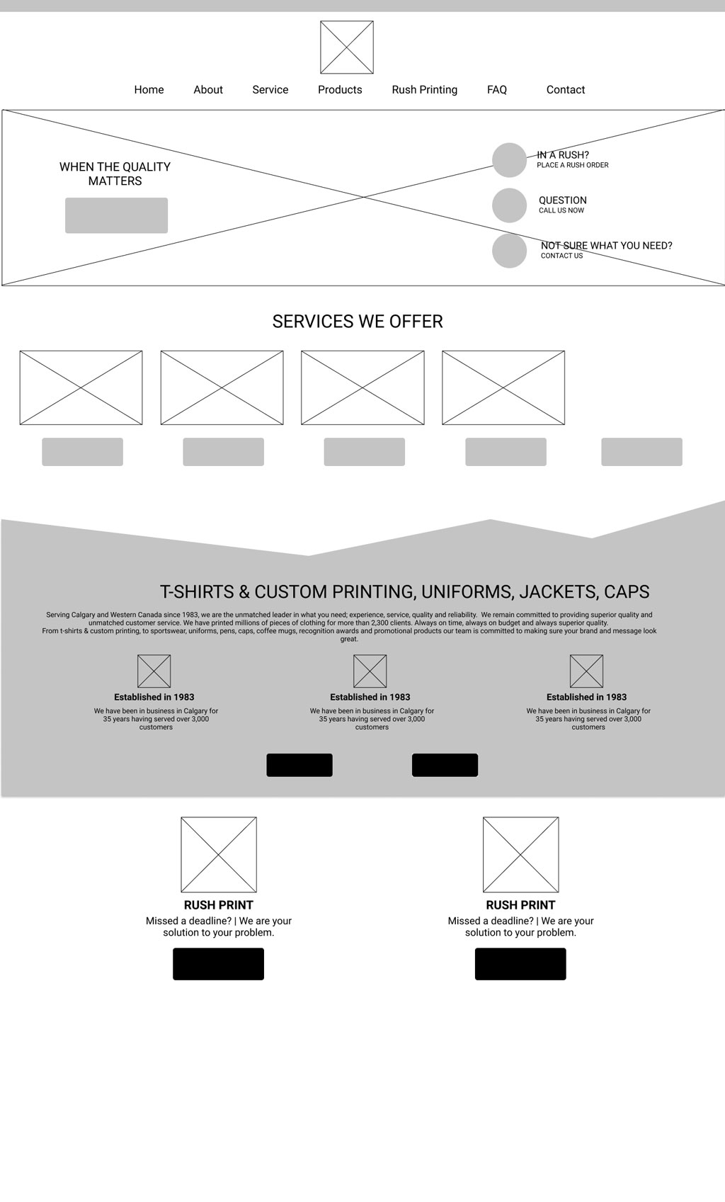
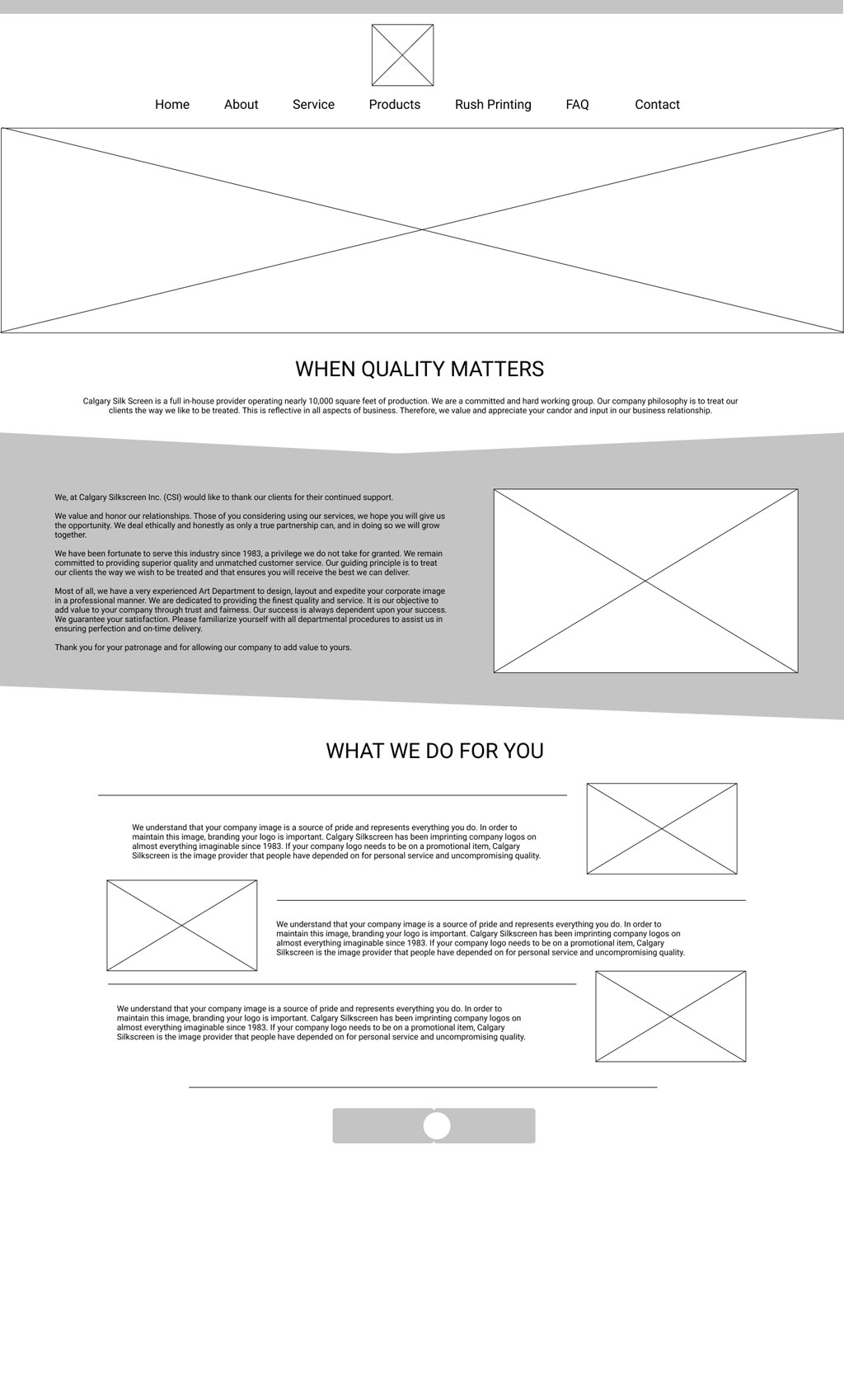
To provide users with an enjoyable experience on the website it’s important to anticipate their need to provide relevant information on each step. Therefore, get to know the user journey will help us draft out the preliminary version for the site. Based on this, it was possible to simplify user-flows between pages by removing unnecessary pages, merging existing and adding new ones when needed. I decided to omit the Gallery page and place the final product image at the end of each Service section to give the validity that will help increase the conversion rate.
III. Style Concept
Give them the visual appearance
I would like to augment the brand awareness by using more of the brand colour on other elements on the website to create a strong and unforgettable impression on the user. The font should be changed to Arial for headings and Lato for body text, which helps achieve a clean, minimal and modern look for the site.riter to help us audit writing and SEO.
IV. User Experience
With better appearance, comes with better experience
Even though my intention mainly focused on revitalizing the site’s look, however, like every design project, it has to help business grow, in this case, increasing the quote requests.
Don't ever forget mobile layout!
Since there was traffic from social media platform (Instagram, Facebook), I had to come up with mobile that is scannable and highlight the feature services that the business offer in order to give the s strong glimpse of our identity
FINAL THOUGHTS
When the quality matters
I took advantage of the company's relocation period to introduce the new website following 2 reasons:
The current (and former) client would check the website for the address of the new location
The establishment of new business in the area would intrigue people, which lead to the new flows of traffic, new users to test the new site out
People’s feedback about the website so far has been positive. I got compliments regarded on the bold new look that reflected the company's identity sharply. The ease of use has been confirmed. There's nothing to determine the accomplished of one project better than data, I've been monitored the website metrics for 8 months and broke them into 3 phrases: before- during and after the revamp process
Avg. Session Duration: 02:02 Conversion Rate from Organic Search: 2.14% Conversion Rate from Direct Access: 4.90% Conversion Rate from Social Media:0%
Avg. Session Duration: 02:23 Conversion Rate from Organic Search: 4.76% Conversion Rate from Direct Access: 12.43% Conversion Rate from Social Media: 0%
Avg. Session Duration: 01:25 Conversion Rate from Organic Search: 9.45% Conversion Rate from Direct Access: 4.42% Conversion Rate from Social Media: 20%
I started redesigning the website when I haven't completed my probation time, which was a lot of pressure, doubts yet thrills. When I first came to the interview with Gord, silkscreen is a completely brand new term to me, I was not familiar with the business concept. However, the most important takeaway is how I put my determination and patience into things I do. I was thankful for the opportunity, the faith my manager put in me that I can pull off the whole project all by myself and make our company stand out in the industry.