Modernized Rebranding Concept for Rau Bistro – Vietnamese Street Food Restaurant
The goal is to create a fun, urban vibe that positions Rau Bistro as Calgary’s go-to hangout spot, offering an exciting fusion of authentic Vietnamese street food with a Western twist. As Calgary’s first-ever Vietnamese street food restaurant, Rau Bistro’s philosophy is to elevate traditional Viet flavors, delivering an innovative dining experience that blends cultural authenticity with contemporary flair.
Vietnamese eatery follows a uniquely delicious path
Despite plenty of Vietnamese restaurants around Calgary area, Rau Bistro has been recognized as a hidden gem: the place that serves the “fancy” Vietnamese “street food”. Their dishes' taste and presentation are very unique and present the chef/owner's personality ardently. Still, the need for an identity that gives customers an impression as strong as the food could not be ignored.
Cam Do, owner of Rau Bistro, offers up grilled piper lolot beef and spring rolls on vermicelli. PHOTO BY LEAH HENNEL / POSTMEDIA /Swerve
DESIGN PROCESS
I. A fresh twist in food needs a refresh in a look
The vision of the chef-owner is to introduce a Vietnamese street food culture to the local folks and to bring a warm embrace of hometown to fellow Vietnamese in Calgary.
As they are planning to relocate and renovate their space, I have discussed with them the direction they want to develop for their brainchild and passion project and draw to the conclusion: rebrand the entire identity, emphasize the cultured root yet be able to fuse to the eating habit of local food lover.
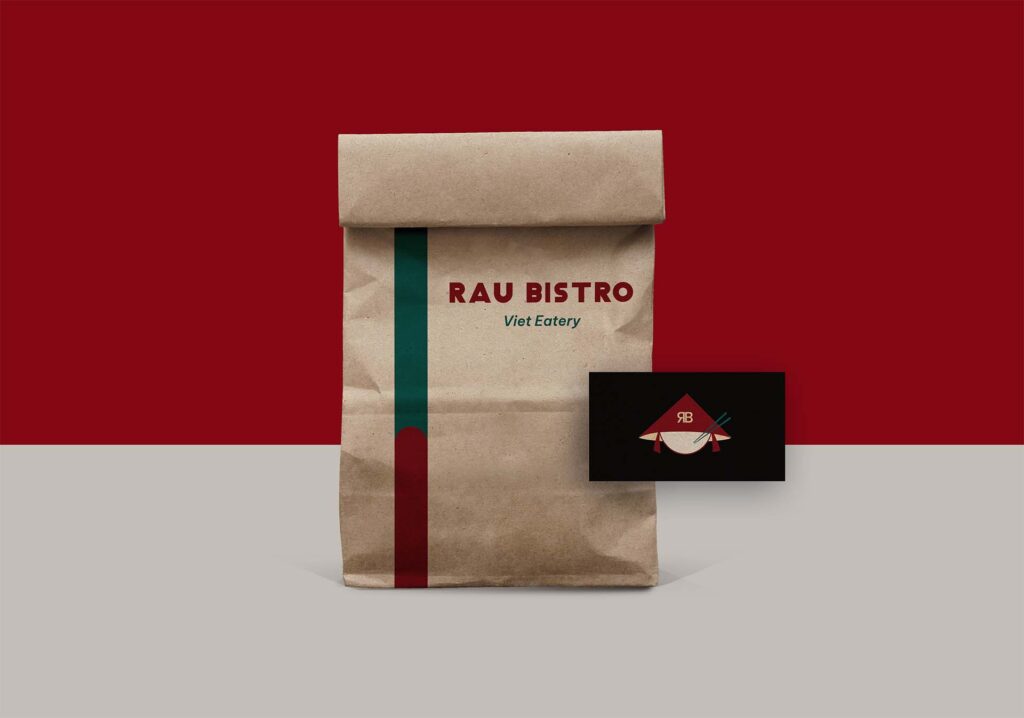
II. Logo Concept
“Rau” means vegetable. The traditional Vietnamese diet is known as prominently balanced, even with street food. Undoubtedly, all of the dishes come from Rau come with a touch of veggie, which the client described that: "Attest to having never had food this fresh at a Vietnamese restaurant in Calgary; it even outshines many “health food” restaurants”. I would like to give the brand presence a character of their food, which explains the reason I pick the dark green tone being the main colour, giving the brand a healthy, earthy feel.
III. Visual Direction
Green present for sustainability, which is one of the reasons I chose it as the branding color. Apart from introducing the beauty of Vietnamese cuisine, they also focus on building a community with a healthy lifestyle. Half of their menu offers vegetarian options and to-go utensils are made from compostable materials. At Raubistro, it is not only about a tasty meal, it's the philosophy that the owners devote their efforts to put in every single detail that make the Rau Bistro's name. The typeface was selected considerately as Classique Saigon is elegant and has an emotional, retro vibe that brings us the nostalgic with a sense of unique culinary art. Also, the modern font like Be Vietnam helps balance the legible, gives the earthy vibe with the combination of the colour palette.